scTML (single-cell tumor mutation landscape) is a pan-cancer single-cell mutation landscape database. The data are from 74 datasets with 2,582,633 cells (or spots) covering 24 tumor types, including 35 datasets of full-length (Smart-seq2) transcriptomic single-cell sequencing, 23 datasets from 10x single-cell technology, and 16 spatial transcriptomic datasets. We collected all single-cell full-length transcriptomic data with raw sequencing reads from GEO, SRA, ENA, and GSA, and manually read their metadata. We also collected high-quality 10x and spatial transcriptomic data as comprehensively as possible according to existing atlas articles and databases.
From around 80T raw sequencing data, we called multiple types of mutations at the single-cell level, including SNVs, insertions/deletions, gene fusions, alternative splicing, and CNVs, along with gene expression, cell states, and other phenotype information. We integrated existing mapping and mutation-calling methods, including GATK, Cellsnp-lite, STAR-Fusion, BRIE, InferCNV, etc., forming a unified computational framework. We comprehensively annotated the cells in each dataset using metadata information and marker genes.
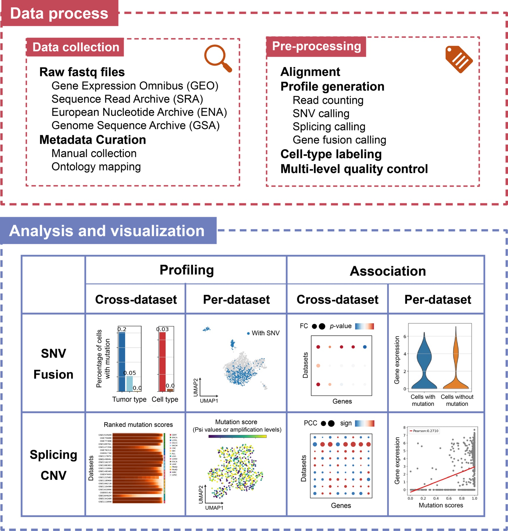
Our analysis framework in scTML is primarily based on full-length transcriptomic data, considering their significantly higher coverage and mutation detection rates. Additionally, we provide the mutation profiles of 10X and spatial transcriptomic data to better utilize their larger data volumes to establish a more comprehensive mutation landscape (Compare Page). The mutation types can be classified into two categories: discrete (represented by the presence or absence in a cell, including SNVs and gene fusions) and continuous (represented by a score in a cell, including alternative splicing and CNVs). And we designed the analysis framework from four aspects: “cross-dataset profiling”, “per-dataset profiling”, “cross-dataset association”, and “per-dataset association”.
We then displayed results from the analysis framework on three web pages: “Mutation profile”, “Association”, and “Compare”. The first page mainly includes cross-dataset and per-dataset profiling. The second page mainly includes cross-dataset and per-dataset associations. In the “Compare” page, we put the profiles of different mutation types from the same dataset together and provided a dataset-centric presentation, considering that the first two pages both selected a mutation first.
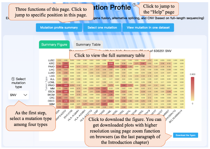
This page provides three functions: Mutation profile summary, Selecting one mutation for viewing the cross-data profiling and ross-data association, and Viewing mutation (per-data profiling) in one dataset. You can click on the top button to jump to the specific position on this page.
As the first step, you need to select a mutation type among four types. Then you can view the summary plot, which shows the top 20 SNVs (or fusion) with the highest mean cell proportion in each tumor type. For alternative splicing (or CNV), the heatmap shows the average standard deviation of Psi values for alternative splicing types (or amplification levels for chromosome segments).
As the second step, taking the mutation type SNV as an example, you can select a mutation gene, and then select an amino acid change. Then the cross-data profile module can show the cell percentage of this mutation in each dataset, tumor type, and cell type. Clicking the “Compare between different mutation types” button can jump to the “Compare” page. Then cross-data association bubble plot shows the differential analysis results on gene expression or cell state profile, regarding cells with the selected mutation as one cluster, and cells without the mutation as the other. The bubble plot shows the top 15 genes with the highest differential analysis significance for each dataset. In the bubble plot, color means direction and dot size means the degree of difference. Clicking the “Explore relationship” button can jump to the “Association” page. Also, note that we require that in the dataset included in the bubble plot, there are at least 10 cells with mutations and at least 10 cells without mutations. The 'Common associations' section shows genes with significant associations with the selected mutation in multiple datasets. If the selected mutation cannot meet the requirement, the bubble plot and button will not appear. When selecting “Fusion” in step ① and selecting fusion genes 1 and 2 in step ②, this page is similar to SNV.
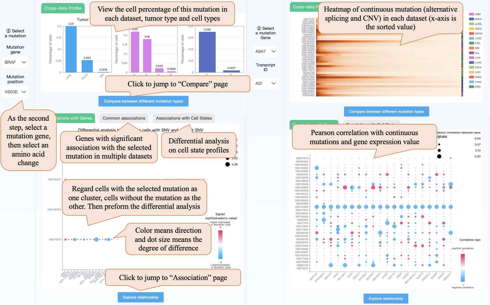
When selecting continuous mutations (“Alternative splicing” or “CNV”) in step ①, the cross-data profile module shows the heatmap of the two continuous mutation distributions in each dataset (the x-axis is the sorted Psi values or amplification levels). The cross-data association bubble plot shows Pearson’s correlation with gene expression and cell state. Also, note that calling CNV needs true non-malignant cells (like macrophage, T cell) as a reference, resulting in there being no CNV profile in some datasets with only malignant cells.
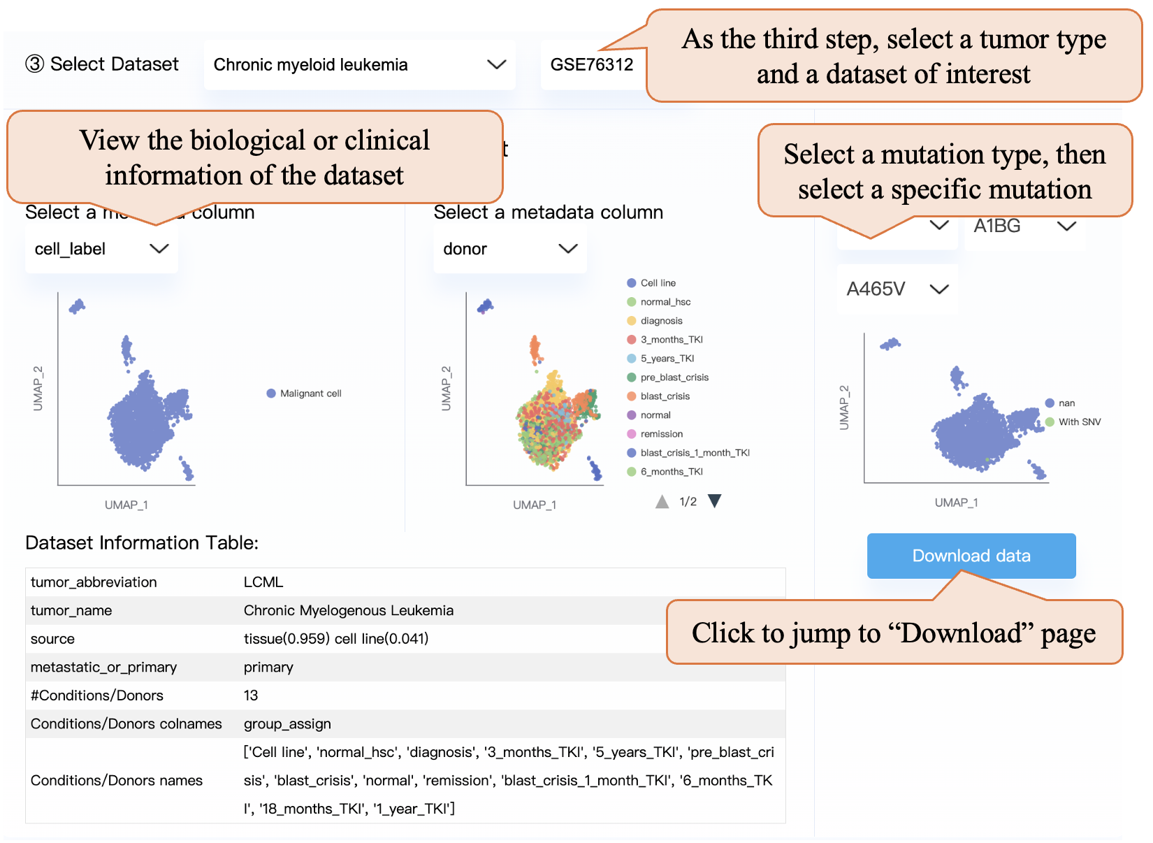
As the third step, you can select a tumor type and a dataset of interest. You can explore the dataset by viewing the dataset information table or selecting a metadata column and then viewing the corresponding UMAP plot. Note that we select a column most representing the grouping (or condition) information of the experiment, and in some datasets, the condition column is the same as the donor column. Also, after selecting a mutation type and selecting a specific mutation, you can view the per-data profiling UMAP plot. Clicking the “Download data” button can jump to the “Download” page and download the corresponding dataset.
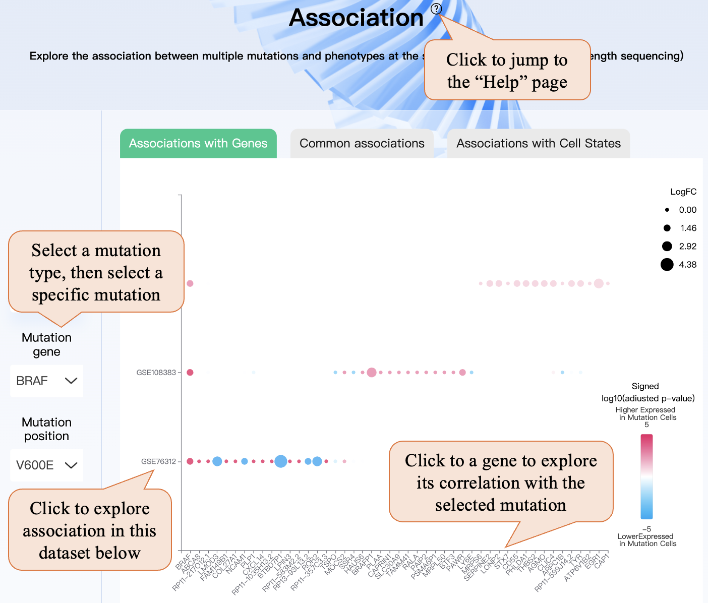
In the “Association” page, similar to the “Mutation profile” page, you can select a mutation type, and then select a specific mutation. In the bubble plot, you can click the dataset name (GSEid) on the x-axis, and this dataset will be automatically selected in step ② then you can explore the association in this dataset below. Also, clicking the gene name or cell state name in the y-axis can lead to the gene being automatically selected in step ③ and exploring its association with the selected mutation.
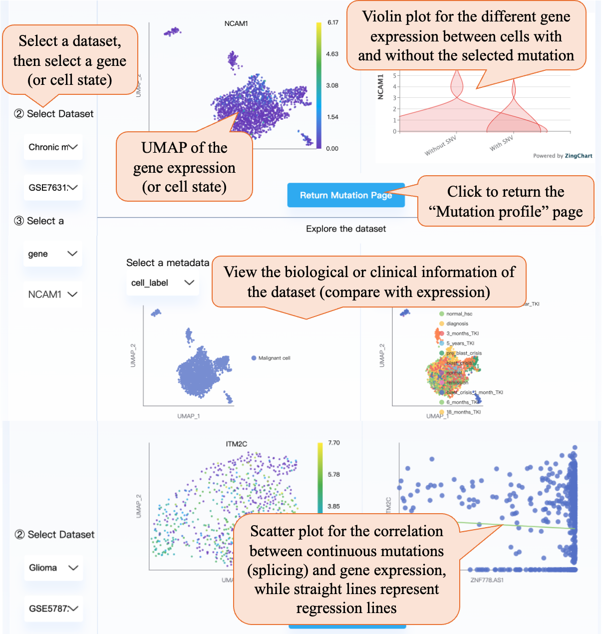
After selecting a specific dataset and gene (or cell state), the right part contains the gene UMAP and the violin plot for the different gene expressions between cells with and without the selected mutation. For alternative splicing and CNVs, you can view the per-dataset association through scatter plots with regression lines. Clicking the “Return Mutation Page” can return the “Mutation profile” page. Also, in the below part, you can view the biological or clinical information of the dataset (compare with expression).
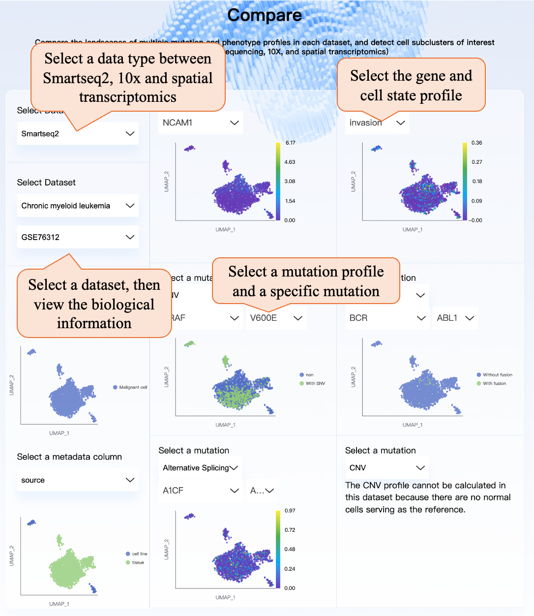
On the “Compare” page, you can first select the data type from Smart-seq2 (full-length sequencing), 10X, and spatial transcriptomics, then select a specific dataset and view the biological information. Then you can select a specific gene or cell state for viewing the UMAP plot, and select specific mutations in SNV, fusion, alternative splicing, or CNV profile. For spatial transcriptomics, scTML provides the tissue images and displays mutation or phenotype information at the corresponding positions of the tissue. This page can be used to compare the biological information, genotype, and phenotype UMAP plot, and find the special cell subcluster of interest.
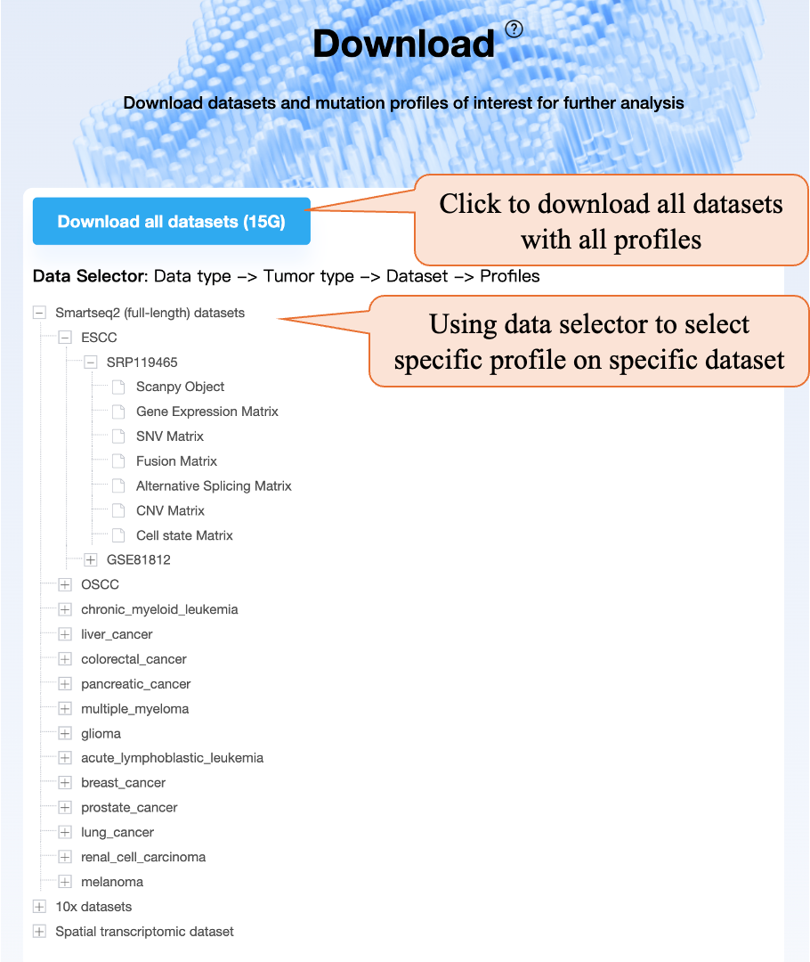
On the “Download” page, you can click the “Download all datasets” button to download all datasets with all profiles. Using the data selector, you can select the tumor type, dataset, and specific profile to download.
Li H, Ma T, Zhao Z, et al. scTML: a pan-cancer single-cell landscape of multiple mutation types. Nucleic Acids Res. October 2024:gkae898. doi:10.1093/nar/gkae898
 E-mail: xglab@mail.tsinghua.edu.cn
 Address: Tsinghua Univeristy, Haidian District, Beijing, China
 京ICP备10214630号